November mock - detail
For my mock i have decided to do 'detail' as i have a lot of good ideas for it, detail can go into a lot of different topics and themes like autumn, weddings nature and so on.


Steve Axford
Steve Axford is an Australian photographer who takes photos of mainly 'magical mushrooms' as it fascinates him. His photos have been featured in magazines all around the world, sharing his discovery of the beautiful mushrooms that he also calls his 'science of fungi'. the photos he takes are in a lot of detail and show almost every part of the mushroom.
I like his photos as each one is different, different colour, shape and size but they all are a part of the same family. I really like the fact that he focuses on the mushroom and the wood under it as it shows some extra background of the photo but he uses a shallow depth of field with F/5.6 so the actual background is completely out of focus. In my opinion when Axford used a green background it was very effective and looked nicer then a black one, as you can see the contrast of the two different colours, but the black one also makes the colour pop if its the white on black.
I like his photos as each one is different, different colour, shape and size but they all are a part of the same family. I really like the fact that he focuses on the mushroom and the wood under it as it shows some extra background of the photo but he uses a shallow depth of field with F/5.6 so the actual background is completely out of focus. In my opinion when Axford used a green background it was very effective and looked nicer then a black one, as you can see the contrast of the two different colours, but the black one also makes the colour pop if its the white on black.


Billy Kidd
Billy Kidd is an American self-taught photographer born in 1980. He took a series of photographs of decaying flowers. The flowers are in the natural process of dying, therefore each flower is at a different stage and shows a different story.
All of his photos focus on only the flower and the detail, it shows different angles of the dying flowers, the colours used are easy to see so they catch your attention. All the photos are a different stage but the colours are similar and all of the flowers are shown in detail, so you can see every folding petal and every wrinkle. I think that the black background looks good against the bright colours of the flowers, the dark colour foreshadows death in the flower as it is dying.
All of his photos focus on only the flower and the detail, it shows different angles of the dying flowers, the colours used are easy to see so they catch your attention. All the photos are a different stage but the colours are similar and all of the flowers are shown in detail, so you can see every folding petal and every wrinkle. I think that the black background looks good against the bright colours of the flowers, the dark colour foreshadows death in the flower as it is dying.


Jan Groover
Jan Groover was born April 24, 1943 she was an American photographer, she done a lot of shows and was featured in the museum of art in new York. Groover was noted for her use of emerging color technologies. In 1979, she began to use platinum prints for portraits and to transform everyday items into a formal still life, which is one of her big successes.
I like how Groover puts a lot of different objects into one photo but still catches the detail of all of them, the different colour contrast in the photograph is good as it catches your attention a lot more then black and white one. The photo it self may look messy because of how the objects are placed but this creates a thought in the mind, you can either think of it as beautiful and that its been placed carefully to get the right shapes and angles in the right places or you may see it as clutter and unorganized.
I like how Groover puts a lot of different objects into one photo but still catches the detail of all of them, the different colour contrast in the photograph is good as it catches your attention a lot more then black and white one. The photo it self may look messy because of how the objects are placed but this creates a thought in the mind, you can either think of it as beautiful and that its been placed carefully to get the right shapes and angles in the right places or you may see it as clutter and unorganized.


Shoot 1- ink
For this shoot i decided to get water and drop a pink ink into it. i took pictures of the water going in to it at different angles.


My least favorite
|
i think this must be ,mt worst photo as even tho the ink in the water looks nice and you can see all the movement of the ink but it isn't in a clear enough focus and i dont really like how you can see the background.
|
|
My favorite
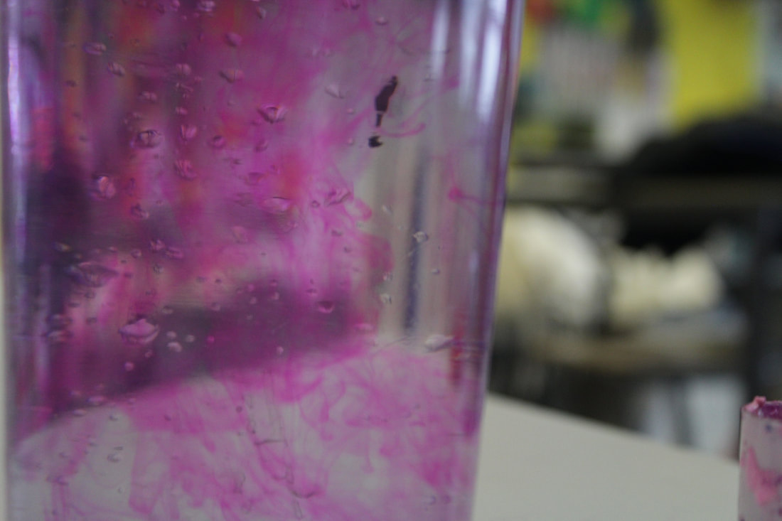
I love this photo as the pink is very vibrant and bright even though it hasn't got any filters, you can clearly see all the different shapes and sizes of the ink, I think the way the ink swirls into different shapes and each part looks a little different makes the photo even better. Composition rules play a part in this as you are straight away drawn to the middle of the of the photo as that is where it is the brightest. The exposure was on a 0 as i didn't want the photo being bright or dark and i made sure that all of the picture was inn focus as i didnt want all of the

shoot 2 - bubbles
For this shoot i decided to take photos of the different sizes of circles in bubbles, one of my shoots is of white bubbles in a sink. My second half is water mixed with pink ink to add more color and with a straw bubbles where blew making them bigger and look nicer.


My least favorite
|
I really dislike this photo as i think it is a bit boring and bland, the aperture seems to low making the photo seem a bit more dark then it should be, the quality of the photo is also quite low.
|

|
My favorite
In my opinion this a is a really good photo, at first the bubbles are out of focus but slowly go into focus then at the end they are full in focus creating a sharp line between the bubbles and background.

shoot 5 - nature
I decided for this shoot i would take pictures of nature outside of school, i took pictures of leafs and plants on my iPhone XR.


My least favorite
|
In my opinion I think that even though this photo is good quality and shows a good example of 'birds eye view' it doesn't fit into detail as much as the other ones but it still is a good example of colors contrasting and the different leafs colors.
|

|
My favorite
This is my favorite photo as I love how the main focus is the line of raindrops on the branch and how the background is a green and yellow out of focus color with some specs of red. This shows the contrast of the autumn colors compared to the clear drops of rain. I also like how you can see the raindrops on the grey metal, as they are all different shapes and sizes.

Shoot 6- Frost
I decided to do another shoot outside of school and took photos of the early frosty mornings. The photos consist of the green grass and leaves with frost, also pictures of the frozen raindrops on the leaves.


My least favorite
|
I think that out of all my photos this is my least favorite, i still think its a good photo. I like the bite marks in the leaf but i think it could of been in more focus to make it look better.
|

|
My favorite
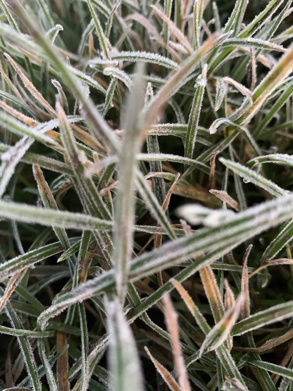
I really like this photo because i like how the background is out of focus so you can still see all the colors of the houses and sky, making the green and white of the grass more clear. The raindrops are also clear add to the detail of the grass.
My Final Piece
For my final piece i have decided to get different photos i have took and use them. I have picked my best photos, printed them and put them into groups pinning them onto a decorated pin board, with the theme of Autumn.


What it looks like;
This is what my finally piece turned out like; i got my pictures, leaves, burned paper and a string. I decided to make a mood bored/ cork board full of all my photos to showcase my interruption of detail in autumn.
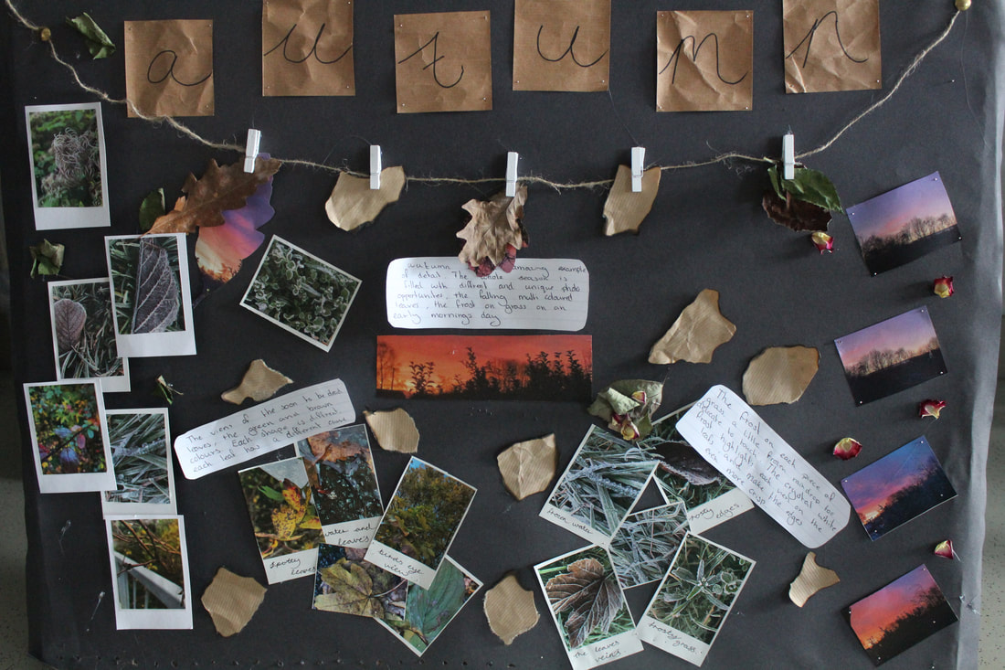


A closer look ...

|
I decided to hang some dry leaves and burnt paper. I also cut a leaf shape out of one of my sunset photos so that the bright purples and pinks would contrast with the dry brown leaf.
|

|
I also lifted some of my photos with cardboard, to give them a different effect. This made them more noticeable as in my opinion they are my best ones.
|

|
On the lifted photos I got one photo which is full of bright colors and then two behind it which where light green and white which made the color contrast better.
|

|
At the top of my final piece in some old brown package like paper I wrote 'autumn' which is what i deiced to base my detail topic on.
|
